

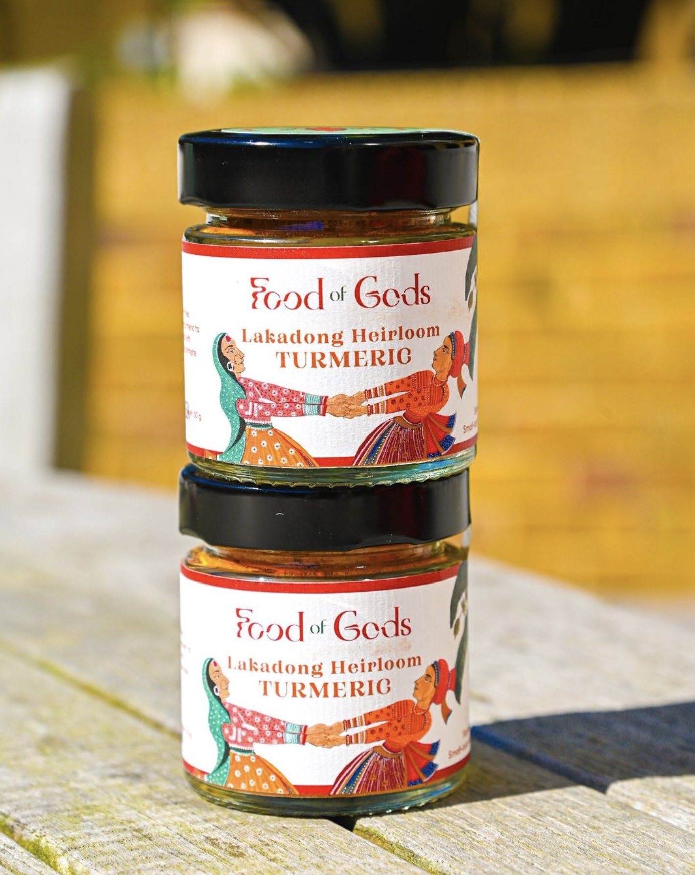
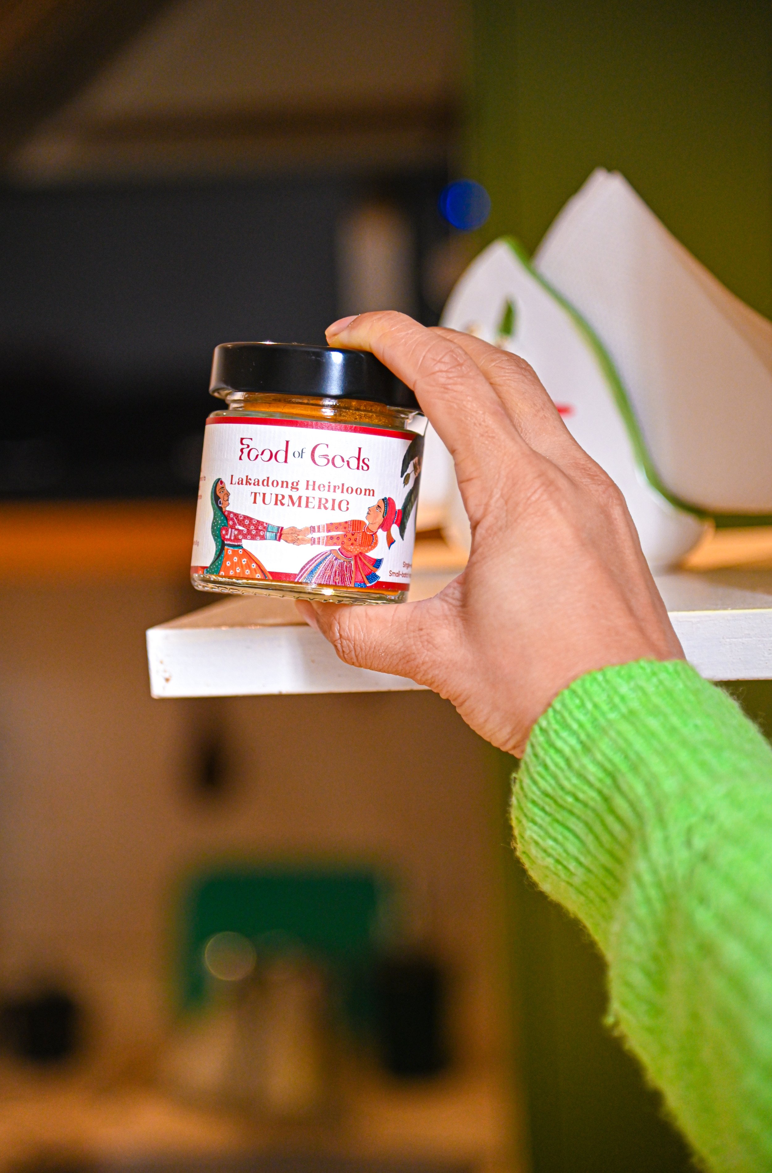
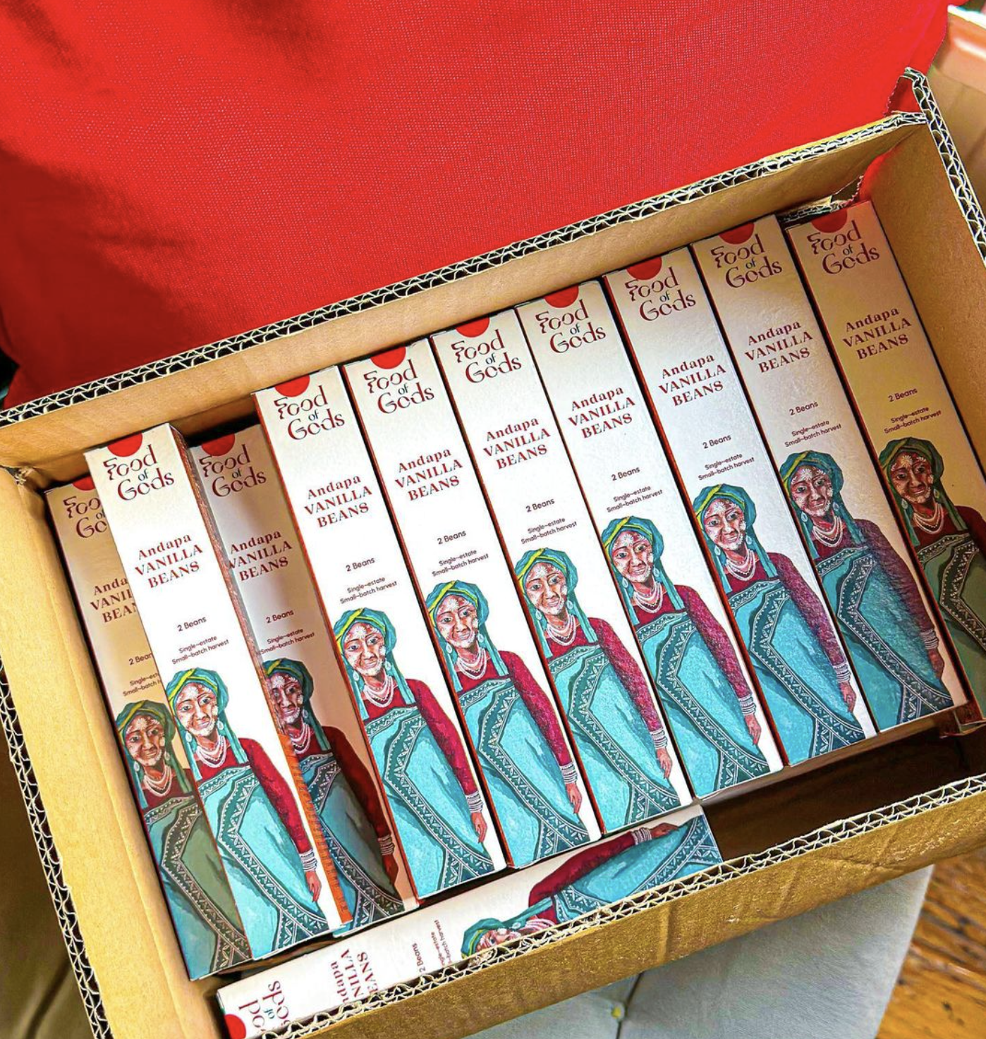
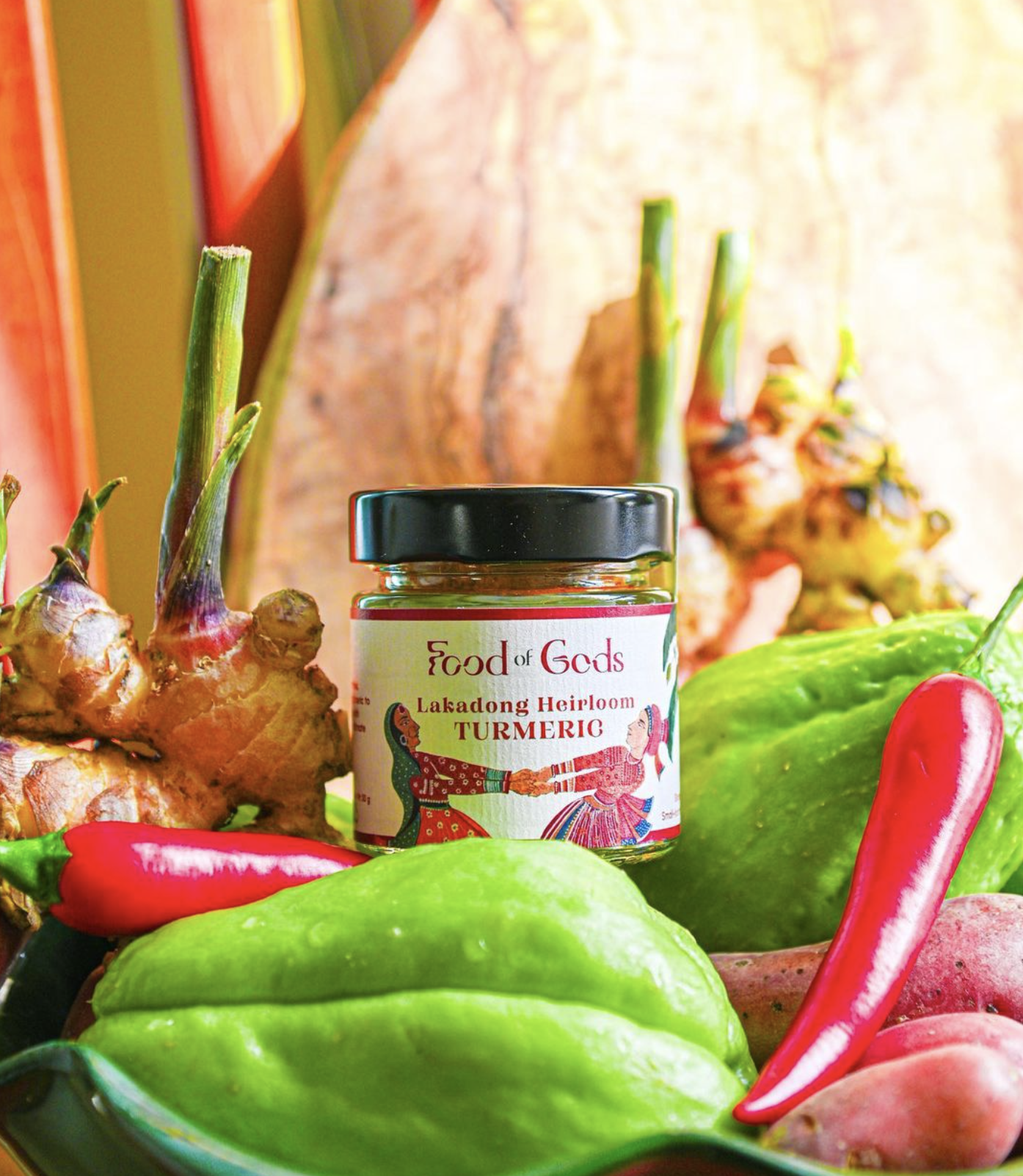
Food of Gods
IDENTITY RE-DESIGN

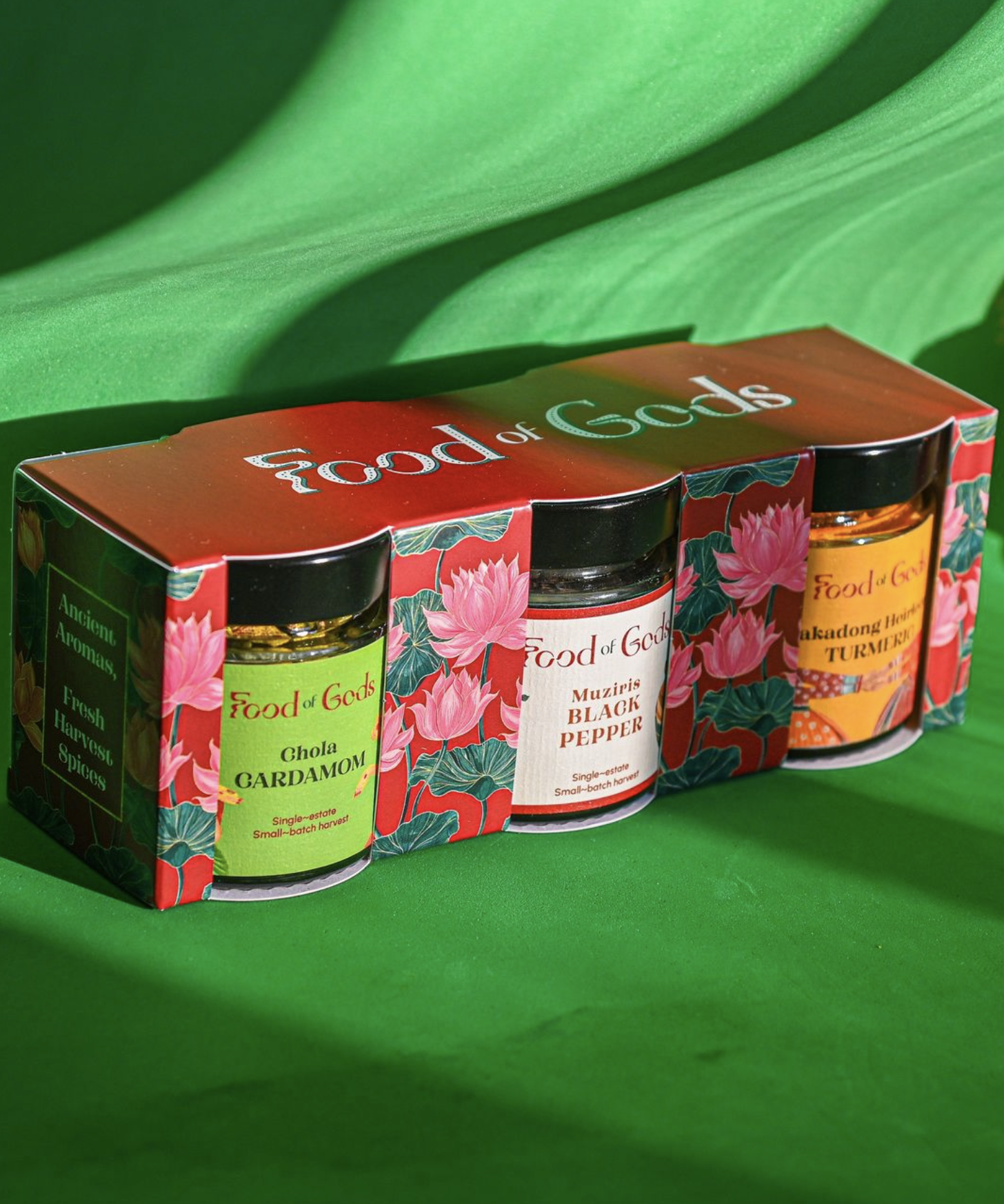
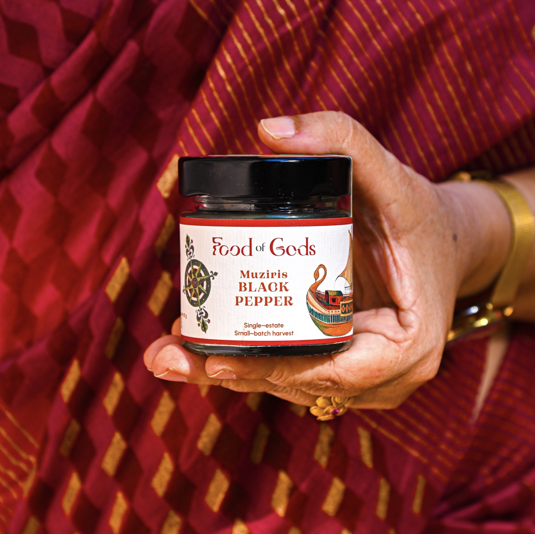
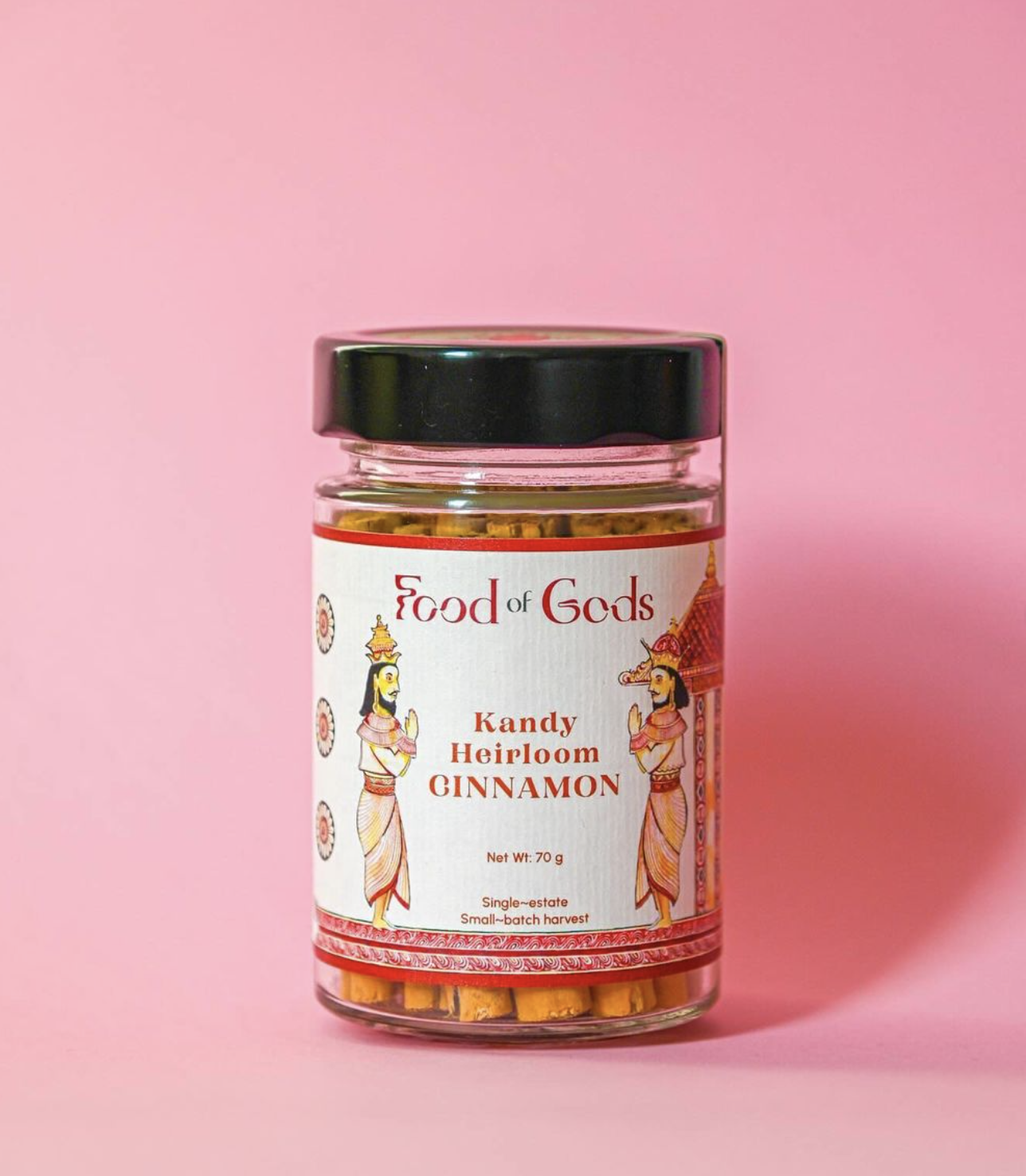
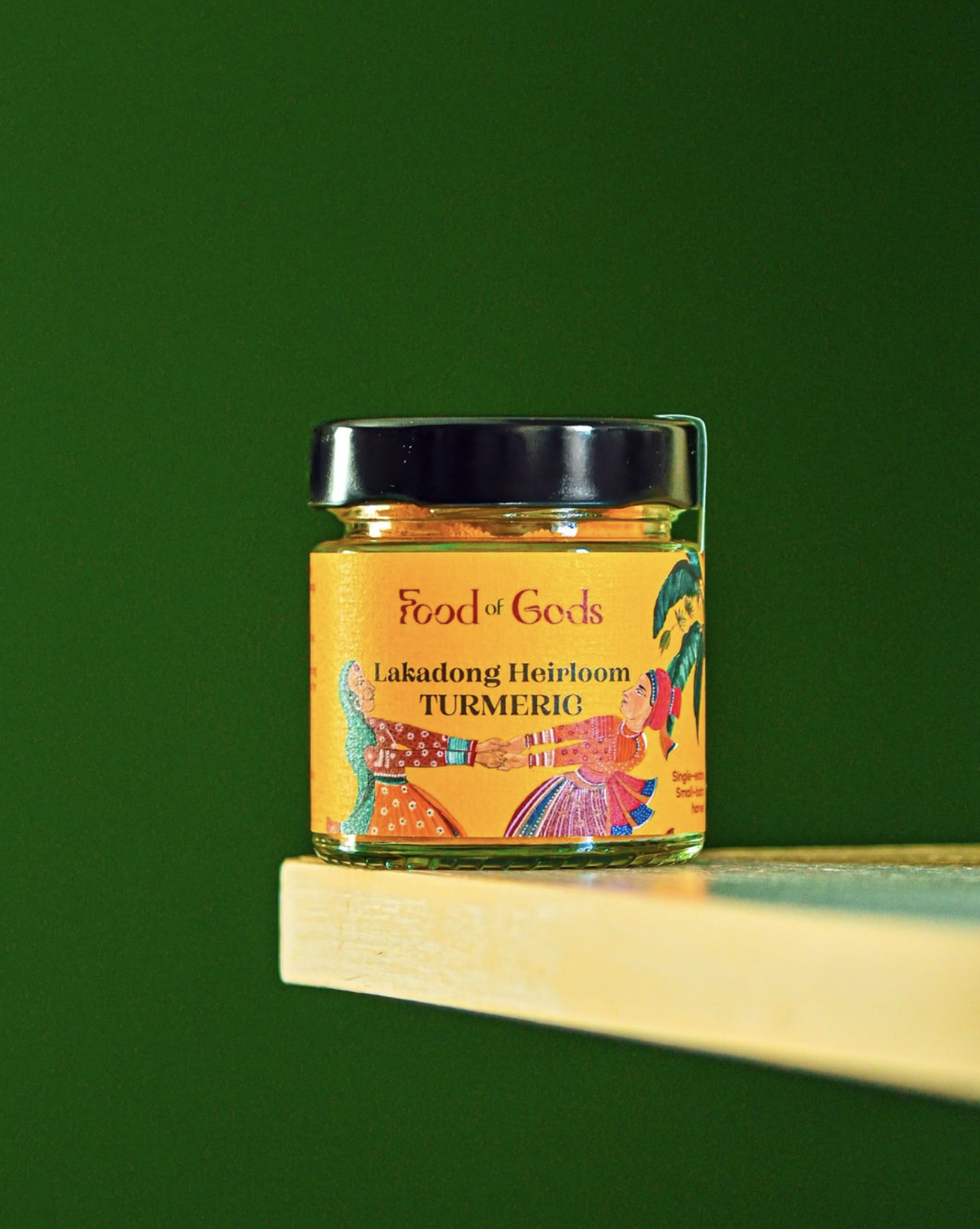
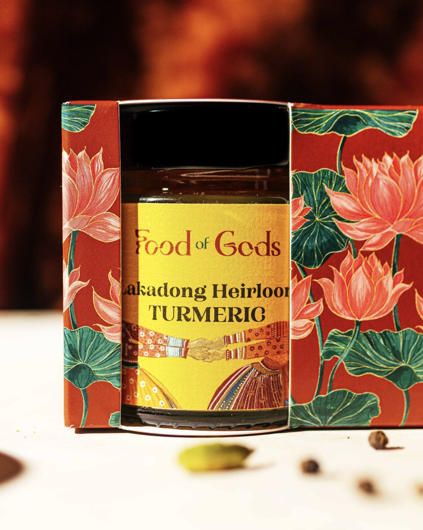
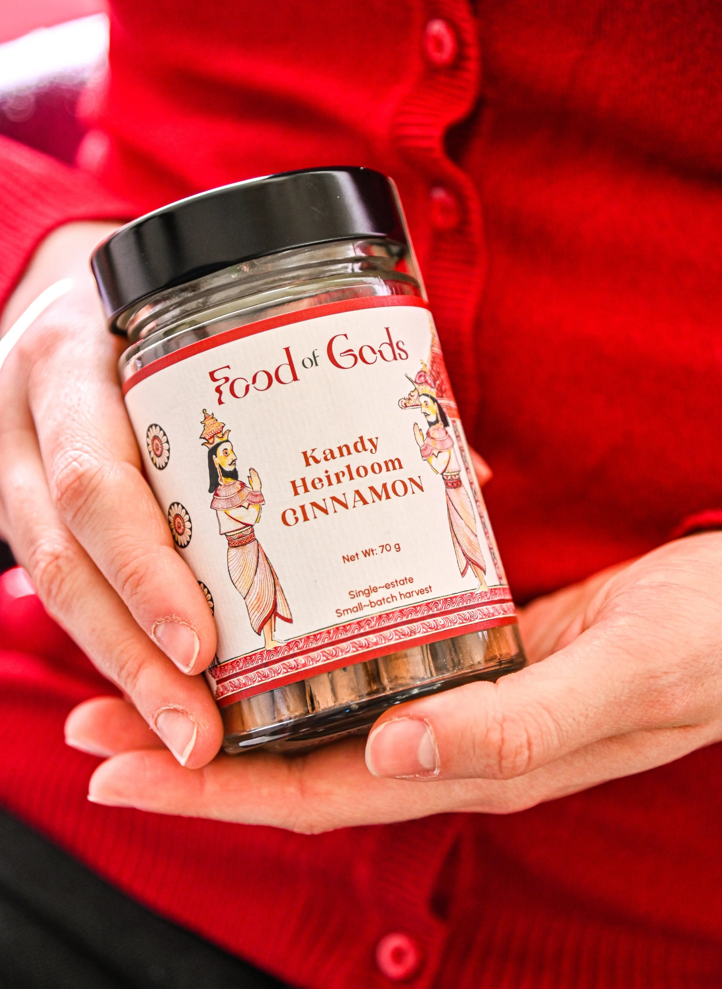
Food of Gods is on a mission to reestablish the intrinsic value of spices and break away from their commercialization. Their goal is to reconnect spices to their roots as culinary enhancers, healing agents, and sources of nourishment. With multi-generational, family-owned farm partners across Madagascar, India, Sri Lanka, and Ghana, Food of Gods prides itself on harvesting spices in harmony with nature–ensuring purity, quality, & sustainability.
OBJECTIVE
Redesign the Food of Gods logo to embody the brand's rich history, cultural significance, and commitment to sustainability. The design reflects the company's dedication to purity and authenticity while paying homage to its global, biodiverse roots.
Client
Food of Gods
Role
Project Manager/Graphic Designer
Location Worked From
Muncie, IN, USA
Client Location
London, UK
Team Members
JC Camacho, Lily Disviscour, Adi Patton, Gracie Luzader, Kyra Davis, and Stan S.


Original logo


Re-designed logo
To achieve a logo that represented what the brand stands for, we drew inspiration from the Food of Gods icon–elements of the lotus and amphorae create a concept that is both unique and relevant to the brand. By using the shapes of lotus petals to form the ends of the O's and D's within the type, the beauty and symbolism of the lotus flower were mirrored while still representing its purity and eternity.
Additionally, the joining of the O’s in the design represents the journey of the spices and the prosperity of the brand. The O and D show different elements coming together, just like the Food of Gods spices come from different countries and cultures.
To represent regeneration, human-to-earth connection, and healing, the G is designed to symbolize a serpent. The serifs of the type were designed to mimic the handle of the amphorae, adding an extra touch of elegance to the overall design.
Overall, the final logo effectively represents the Food of Gods brand, highlighting its rich culture while also showcasing its values and unique qualities. It is a beautiful and timeless design that will continue to represent the brand for years to come.

purity
eternal
heirloom
culture
heritage
origin
honest
purity eternal heirloom culture heritage origin honest
Concept Mood Boards


Logo Development
This acts as a testament to the design process, showcasing the various steps taken to arrive at the final design. It highlights the importance of experimentation & iteration in the creative process.
The images below showcase the extensive development process for the final logo design. Each logo variation was meticulously designed, incorporating symbols that reflected the brand's core values and mission.


The Finalized Identity
LOGO & LOCKUPS
Monogram

Horizontal lockup

Vertical lockup

Primary logotype

Secondary logotype
⬆ DETAILED VERSION ⬆


⬇ SIMPLIFIED VERSION ⬇
Monogram

Horizontal lockup

Vertical lockup

Primary logotype

Secondary logotype


